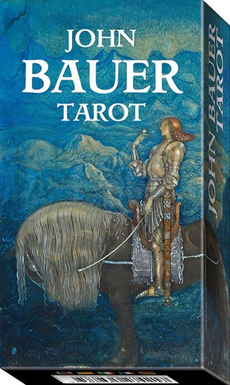
One of the most appreciated Swedish illustrators and artists of the beginning of the 20th century and contemporary of Pamela "Pixie" Smith, John Bauer (1882-1918), created a world of myths and folklore both sweet and dark, where fairytale atmospheres intertwines with Pre-Raphaelite suggestions.
As a Total Tarot deck, there's no unboxing video. You can see the flickthrough on TikTok.
Total Tarot is a bimonthly magazine designed to help teach anyone how to read tarot. With every two issues, readers get a complete tarot deck from Lo Scarabeo, one of the major Tarot companies on the market. The art of these decks is true to the originals, but they have frames where the originals don't and the LWB is not included, instead there is some information in the magazine about the history of the deck and the specific meanings attached to cards. This is a great collection if you want to try a lot of styles of deck at very reasonable prices - I'm learning a lot about my preferences!
The magazine wasn't clear on this, so I'm happy to be corrected, but I believe that, like the Pre-Raphaelite deck, John Bauer didn't design this deck specifically; rather, the images have been chosen from his body of work. I'll be honest, this isn't my favourite deck, but the images are lovely and there's a lot to learn here for the right reader.
With no LWB or box, we'll go straight to the cards. They feature this non-reversible back:
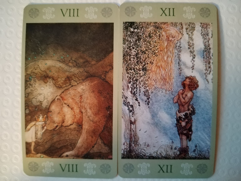
The images are drawn from John's folklore work, and as such share broadly the same colour palette. These were mostly Northern folktales, so there are lots of deep greens, dark greys and blues along with the bright yellows and light greens. Majors have their number only, in Roman numerals, at the top and bottom of their image. Minors have their number, in Arabic, at the top and the symbol of their suit at the bottom. Courts have a small symbol at the top. It took me a while to figure out Page and Knight, as the Page has a helmet that could easily be for the Knight, but the Knights have a horse head!
Here are some images:
I can't recommend this for beginners; the images are too far from RWS standard, and the lack of titles on the Majors makes them difficult to read. However, as an art deck, this is gorgeous, and for a reader who was comfortable with a more abstract deck there's a lot to learn here. I did find that some cards, while not appearing to match with RWS, did when I worked at it a little, so with some time they may be move obvious than they appear at first glance.
My Querants found some of the images unsettling, but thought the reads were accurate and generally optimistic, which was nice! This isn't my favourite deck, but I'm glad I got to work with it, and I'll work with it again in the future.


No comments:
Post a Comment