Unlock transformation, growth and joy with this beautifully crafted, plastic-free tarot deck and discover the powerful opportunities that can emerge from change.
Drawing inspiration and symbols from traditional tarot and personal experiences, illustrator Ari Wisner has created a diverse, innovative tarot deck that will show you the beauty at the core of change.
Whether joyful or painful, change can be utterly transformational - it is often followed by a new beginning in which we can find healing and growth. Ari explains that no matter what we've gone through - good or bad - we're being prompted by the universe to consider the important things in life.
Ari believes that everyone should be able to see themselves in these cards, regardless of gender identity, sexuality, ethnicity, ability, or body. The cards tell the story of transience, kindness and opportunity. They include traditional tarot archetypes that have been renamed to reflect a gender-neutral perspective, and objects and insightful symbols are used instead of the human body in most cards. Three bonus cards are also included - Past, Present, and Future - to be used in your practice however you desire.
Including 29 bespoke poems by Fausta Joly, the accompanying guidebook is full of insightful descriptions and empowering messages. Let the spirit of growth take the lead in your life and shift your focus from darkness to the bright, shining light of change and opportunity!
The Transient Light tarot is available now from Hay House. You can see the unboxing and flickthrough videos on TikTok.
For those of you who like a gentle, minimalist deck, this is one you should consider. For those of you who like an honest, straightforward read, this is one you should consider! And for those of you who aren't sure about decks with extra cards, this is definitely one you should consider.
The deck is advertised as having 81 cards. The three extras are a Past, Present and Future you can use when doing that kind of read. If, like me, you were a little worried about learning three new cards, don't worry. They don't affect your readings in that way. Hay House, of course, are one of the leaders of MBS titles, and have plenty of experience in tarot decks. This is a wonderful, semi-minimalist deck that reads clearly and honestly.
The cards are about normal tarot size, and the box is just big enough to hold them, with a lid that comes down over them. The box has a wonderful, slightly rough texture; even before I got to the cards, I was enjoying the tactile sensation. The LWB is the same size as the cards and sits neatly above them in the box.
This deck was initially self published through Kickstarter, and Ari, the writer and artist, talks a little about that in the book. Like several others, this deck was created during the COVID lockdowns as a reaction to the feelings and emotions stirred up by that experience. It's deliberately been made as gender free as possible, right down to changing the names of some cards; I'll come to that in a minute. Like some of my favourite creators, Ari is clear that the best way to read and experience Tarot is the way that works for you; although there are suggested meanings and spreads given, we're encouraged to find our own way of doing things. I love a low pressure approach like this.
Ari had a friend, Fausta, create bespoke poetry to go alongside the deck. Each Major card has a poem, each Minor suit has one, and there's one for the deck as a whole as well. These are all printed in the LWB. Each Major card is technically two pages; one is the poem, while the other has a small image of the card, keywords and a description. There's no reversed meaning and reversals are not mentioned anywhere in the LWB.
There are three spreads; a Past Present Future and then one each from Ari and Fausta. They're meant for specific times of year, so I haven't tried them, but I do plan to.
As part of the effort to de-gender the deck, the following cards have been renamed:
II The Revealer
III The Nurturer
IV The Defender
V The Proclaimer
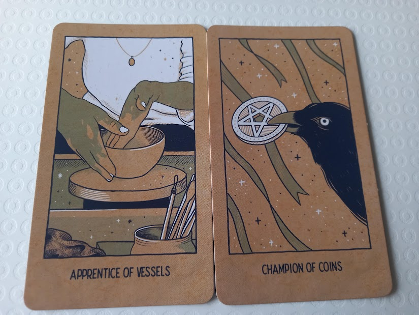
In addition, instead of Pages, Knights, Queens and Kings we have Apprentice, Champion, Keeper and Crown. As always with a renamed deck, it took me a little while to learn the new titles, but they're very logical so it wasn't too hard. In the Minor suits, we have Swords, Wands, Vessels and Coins, which were easy to learn.
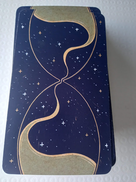
The cards themselves are a beautiful smooth texture. They have this amazing back design:
In person this is a fabulous, rich blue with gold and white stars. It's almost perfectly reversible - all the stars and the sand stream are in the same places - but there are tiny, barely visible streaks, like shooting stars, and they aren't replicated across the card. However, you'd have to be so close to the card to see them, you'd basically have your nose on it, so for all intents and purposes this is a reversible back. If you don't like to know which cards are reversed in your reading, this is a perfect deck.
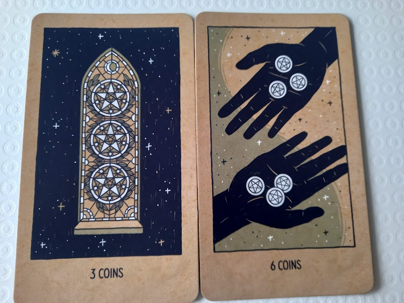
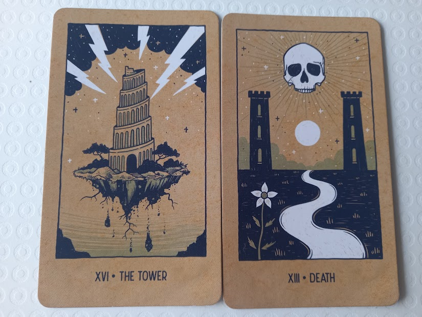
The cards have a brown background, like old paper bags, and the images are picked out in black and white against it. They're a minimalist design, with almost no people appearing - there's some hands or eyes here and there but basically no full figures. That doesn't mean these are hard to read, though; they're some of the most expressive cards I've seen, designed perfectly to be easy to read despite the lack of figures. Images appear in a frame with the card title printed below. Majors have their numbers in Roman numerals, while Minors are in Arabic and are written as, eg '9 Swords'.
This is one of those decks where I could have given pictures of every card, but here are some samples. The flickthrough is linked above.
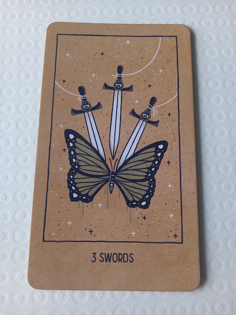
This deck is very honest in readings, but not brutal as some are; there's a gentleness about it. However, it's not afraid to be direct. One of my regular querants is associated with a charity whose symbol is a butterfly; she came to the charity in very sad circumstances. When she pulled a card, it was the Three of Swords, which always represents sadness and heartbreak and in this deck shows a butterfly pinned by three swords. Can't get more obvious than that! She did admire the artwork though and thought the readings we did were accurate.
This would be a great deck to use with people who weren't sure about tarot, because it leaves out a lot of the 'scary' imagery of other decks. There are a few skulls around, but the tower hasn't fallen yet, the devil is a snake rather than a demon, and the ten swords haven't pierced anyone's back, and in fact they're broken.
This is going to be one of my regular decks, whether it's reading with it or sitting quietly and mediating on the images. Either way, I'll enjoy it very much.







No comments:
Post a Comment