
This sweet deck takes a look at what we perceive femininity to be, especially in tarot, and challenges it. It's cheerful and soft artwork encourage readers to find the bright side in the worst circumstances. Feminine energy can be strong and powerful yet vulnerable and emotional, and Velouria's Tarot takes the traditional gender binary in tarot and encourages the reader to take a new perspective on what 'feminine energy' means.
The artist created the deck during a difficult pregnancy and the global pandemic and the artwork reflects her journey of holding on to joy and hope, even during the most difficult of times. Velouria's Tarot's goal is to encourage every reader to use the tarot as a tool of self-improvement, spiritual exploration, through the lens of finding the silver lining in every situation.
Velouria's Tarot is published by Rockpool Publishing and is available now. You can see the unboxing and flickthrough videos on tiktok.
This is my second Rockpool deck and I'm really liking their style. The size is great, the colours are lovely and, although the two decks are written and illustrated by the same person, they are quite different experiences.
Velouria's was designed during a difficult pregnancy, with the author focusing on the femininity of tarot. As such the colours are all pastels and the characters on the cards are female presenting, though the language in the LWB is non gendered as far as it can be. It's quite a sweet looking deck. However, it's not fluffy; some of the cards look fairly vicious. We'll get to that in a minute though. First, the LWB.
The LWB is small and neat but easy to read. Opening with an introduction explaining the creation of the deck, there's some advice on consecrating your deck, phrasing your questions, and two spreads, a one card and a three card. This is followed by a brief explanation of the structure of a deck. There's no mention, here or anywhere in the book, of reversals.
Each card gets two pages, one a reproduction of the card with a couple of keywords, one a nice juicy description of the meaning. The language is chatty and familiar, not too formal, which is lovely.

Now, the cards! They have bright pink spredges and this lovely, reversible background:
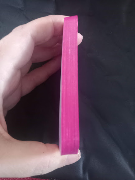

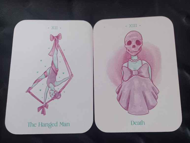
The cards are borderless, though the images mostly don't reach the edges anyway, being quite simple and centered on the card. Backgrounds are aqua blue, pink or white and the images are all in those colours as well, which seems like it would be limiting but actually works really well for them. (I don't know why I'm always surprised how well it works! This is my third deck with a limited palate and they're all great.) The characters don't seem to be tied to any particular culture, which is nice. Majors have the Roman numeral at the top and the title at the bottom; Minors have the title spelled out along the bottom.
Two things to note; Pentacles in this deck are Crystals, an easy mental adjustment. The other thing I noted - and this may just be me - is that the wands, the actual wands in the illustrations, looked quite like the swords, but as each card is labelled it's not a big problem.
Here's a few samples (remember you can see all the cards in the flickthrough linked above):


I found in readings that this deck doesn't come straight out and give answers; it needs a bit of thinking about, some lateral thinking and debating with my subject before we landed on it - but once we understood it, wow, it was exactly right! This isn't the deck I'll be grabbing for a quick one card read in the morning, but when I need to really get to the heart of something, this will definitely be the one. It's also a great deck to hold and shuffle so it'll stay close at hand for that! If you're willing to put some work into your readings, I highly recommend this deck.

No comments:
Post a Comment